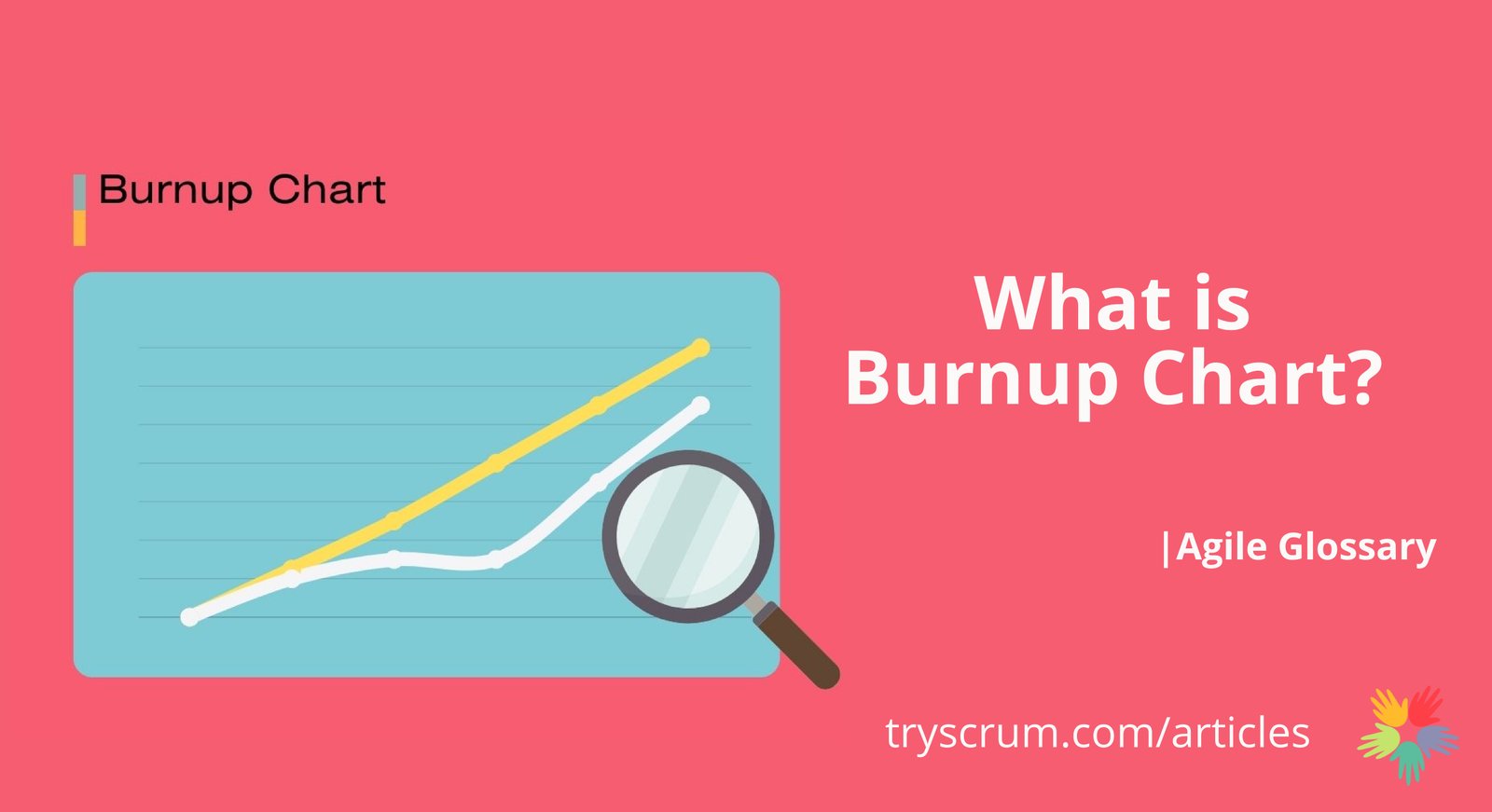
A burnup chart is a visual tool in Agile project management that displays completed work over time against the planned scope. It consists of two lines: one for cumulative work completed and another for total scope. The horizontal axis represents time (days or sprints), and the vertical axis measures work units like story points or tasks.
Key Features of a Burnup Chart
Progress Tracking
Shows how much work has been completed, helping teams monitor advancement toward goals.
Scope Changes
Clearly reflects adjustments in scope, like added or removed tasks, by altering the scope line.
Forecasting
Analyzing trends of both lines helps predict future progress and obstacles.
Benefits for Agile and Scrum Teams
Enhanced Transparency
Provides a clear view of progress and scope changes, improving team communication.
Improved Planning
Helps in sprint planning by showing completion rate relative to scope.
Early Problem Detection
Visual deviations highlight issues early for quick resolution.
Creating a Burnup Chart
Define the Total Scope
Determine the set of tasks or user stories for the iteration, sprint, or release.
Set the Time Frame
Establish a timeline divided into intervals like days or sprints.
Plot the Data
At each interval, record cumulative work completed and update the scope line.
Analyze Trends
Review the chart regularly to assess progress, adjust plans, and share with stakeholders.
Conclusion
Burnup charts are valuable for Agile and Scrum teams, offering insights into progress and scope dynamics. They complement burndown charts by focusing on work completed and highlighting scope changes, enabling teams to manage projects more effectively.
