
February 17, 2025
What is a Burnup Chart?
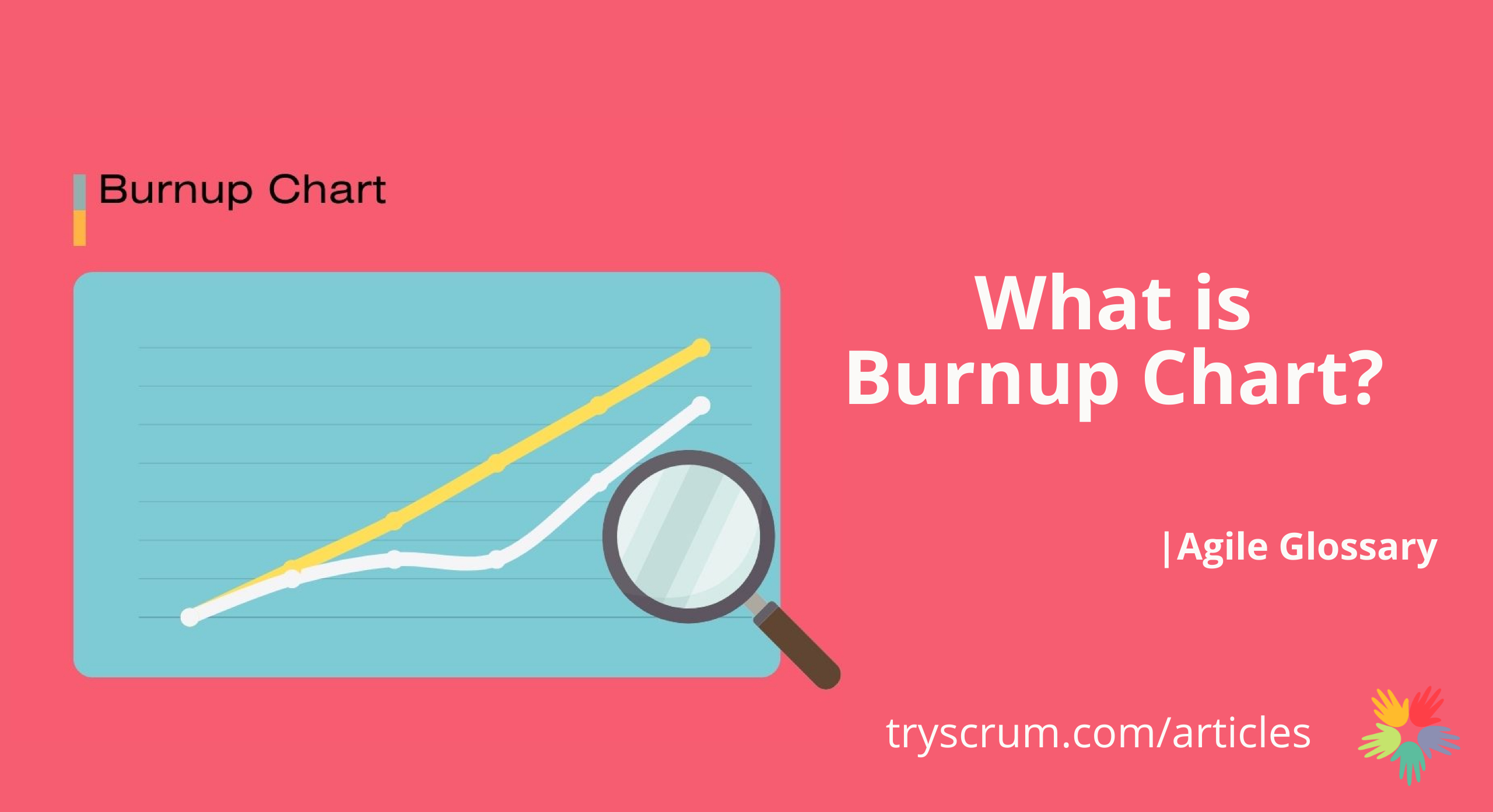
A burnup chart is a visual tool in Agile project management that displays completed work over time against the planned scope. It consists of two lines: one representing the cumulative work completed and the other showing the total scope. The horizontal axis indicates time (days or sprints), while the vertical axis measures work units, such as story points or tasks.
Key Features of a Burnup Chart
Progress Tracking
The chart shows how much work has been completed, helping teams monitor their advancement toward project goals.
Scope Changes
It clearly reflects any adjustments in project scope, such as added or removed tasks, by altering the total scope line.
Forecasting
By analyzing the trends of both lines, teams can predict future progress and identify potential obstacles.
Benefits for Agile and Scrum Teams
Enhanced Transparency
Burnup charts provide a clear view of progress and scope changes, promoting better communication among team members and stakeholders.
Improved Planning
Understanding the work completion rate relative to the total scope aids in better sprint planning.
Early Problem Detection
Visualizing deviations between planned and actual progress allows teams to identify and address issues promptly.
Creating a Burnup Chart
Define the Total Scope:
Determine the set of tasks or user stories for the iteration, sprint, or release.
Set the Time Frame
Establish the timeline for tracking progress, divided into consistent intervals like days or sprints.
Plot the Data
At each time interval, record the cumulative work completed and update the total scope line as necessary.
Analyze Trends
Regularly review the chart to assess progress, adjust plans, and communicate status to stakeholders.
Burnup charts are valuable for Agile and Scrum teams, offering insights into progress and scope dynamics. They complement burndown charts by focusing on work completed and highlighting scope changes, enabling teams to manage projects more effectively.

Recent Articles


Subscribe To Our NewsLetter
Request More Info